How to Add Sigmoidal Trendline in Excel (2 Simple Steps)
Excel does more than calculate numbers, and it also makes graphs or charts. As for the statistical and mathematical part, it can quickly solve any equation, save time, and make the work process more efficient.
So, the question might arise: how to add sigmoidal trendline in Excel?
We will learn exactly that, along with how to format the graph. Let’s get into it!
What Is A Sigmoidal Trendline?
In the empire of mathematics, a sigmoidal trendline is significant. It’s also called s-shaped curved. A sigmoidal curve has been used in many sections and has real-life examples.
We can use a sigmoidal trendline to use any time-related analysis. Besides, the s-shaped curve is also helpful in many financial terms, such as cash flow, project forecasting, etc.
And, of course, budgeting and comparison in other uses of this tool. It is also used for cumulative values, which we’ll use in this post.
How to Add Sigmoidal Trendline in Excel (Step-by-Step)
Making a sigmoidal trendline in Excel is easy. Here, we will briefly show how to do that within a few steps.
Step 1: Enter the data
For the first step, we will enter the data for the sigmoidal trendline. As you can see, there are X and Y data in the picture.
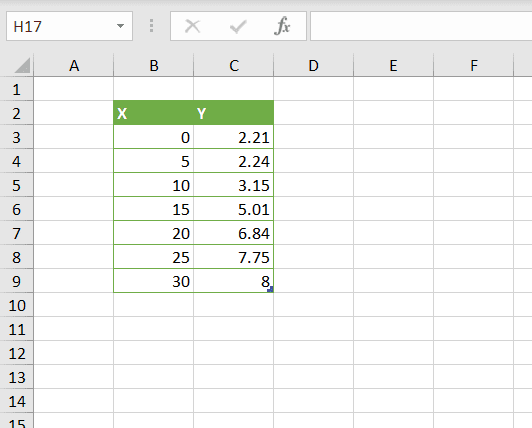
The data in the columns are non-linear, which is precisely what we need for the sigmoidal trendlines. That will make the s-shaped curves.
So, select the data from there. Just click any cell from those two columns that contain any data, and press “Ctrl + A.”
Step 2: Go to the “Insert” tab > Select “Scatter” Graph.
We need to go to the “Insert” tab to add the sigmoidal trendline. Then, you will find “Insert Scatter (X, Y) or Bubble chart”; click on that.
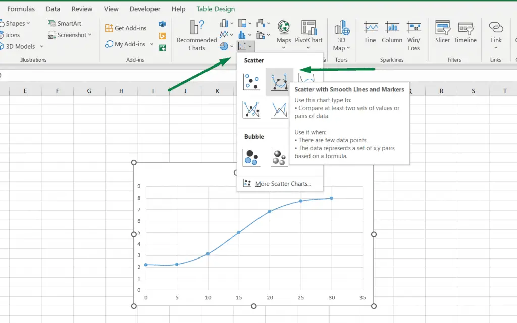
There are five different options from the scatter chart options. The “Scatter with smooth lines and markers” is the perfect option for the sigmoidal trendline. Click on that.
Or, you can press a shortcut, “Alt + N + D,” to open all the “Scatter Graph” options and select one from those.
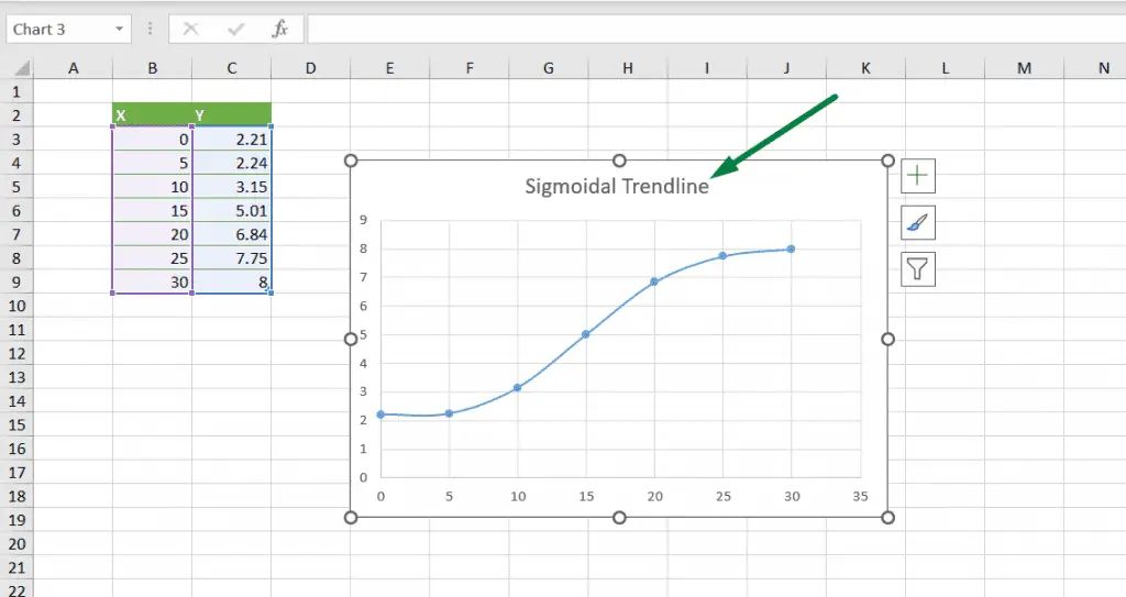
After clicking the option, we will have a graph like this. Change the graph title form there, and we’re good to go!
> Read More: How to Make Graph Paper in Excel
But there are more things or formatting we can do. Let’s see that.
How to Format A Sigmoidal Trendline in Excel
We can format a chart or graph in many ways in Excel. Here, we are going to learn a few.
The first format we are going to use is the data callout. Sometimes, we want to see the options or x and y points in the graph.
For that, click on the graph in Excel. That will show two more ribbons in the ribbon area: chart design and format.
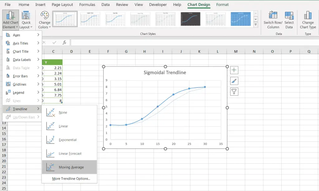
Go to the “Chart Design” ribbon. You will see the “Add Chart Element” option in the left corner. Click on that.
You will see a bunch of options in there. Move your mouse cursor on the “Data Labels,” and you will see the “Data Callout” option. Click on that.
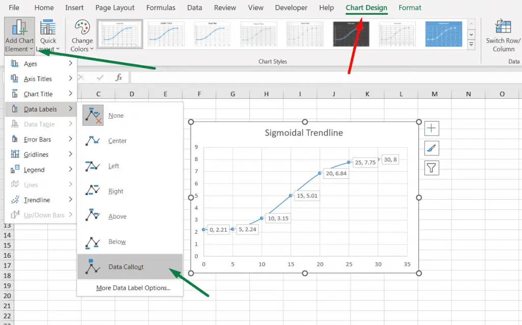
After that, Excel will show the data labels in there.
> Read More: How to extend a trendline in Excel
We can add another thing in there, among other options. We can also add trendlines to the graph.
Similarly, you will find the “Trendline” option in the “Add Chart Element” section.
As for the other chart elements, we can add axis titles, chart titles, error bars, gridlines, and legends.
Tip #1: You can change the chart style and color from the chart design ribbon.
Tip #2: You can also add an alternative text to the chart if you want to describe it.
Final Words
That was all from us about how to add sigmoidal trendline in Excel. We hope you can quickly make a sigmoidal or s-shape curve graph in Excel.
Good luck!

Hi! I’m Ahsanul Haque, a graduate student majoring in marketing at Bangladesh University of Professionals. And I’m here to share what I learned about analytics tools and learn from you.