
How to use quick analysis tool in Excel
The primary purpose of using Excel is to do the data-related work more effectively and efficiently. Excel does that very well. But when you are just starting to learn Excel and see all the options, tabs, and ribbons might seem complicated to understand.
To do a specific type of work, you might get lost in the Excel maze and couldn’t find the options to do the work in Excel. You might even feel overwhelmed and quit learning Excel. We have a solution that you might not know of, which is to use a quick analysis tool in Excel.
In this article, we will learn all about how to use quick analysis tools in Excel.
What is a Quick Analysis Tool in Excel?
Excel has built a fantastic “Quick Analysis Tool” tool that might help you solve the fundamental problems you are trying to solve. A quick analysis tool is a collection of specific tools to format your data, create charts, calculate totals, create tables and pivot tables, and lastly, sparklines.
You can not add or delete those options from the tool nor find the quick analysis tool in any ribbon. Those options are fixed and limited to some extent.
So, what are the tools that come with the quick analysis tool?
Quick analysis tool comes with a total of 26 tools (or options to analyze your data) under a total of 5 sections.
- Formatting (Data Bars, Color Scales, Icon Set, Greater Than, Top 10%, Clear Format, Last Month, Last Weak, Greater Than, Less Than, Equal To)
- Charts (Clustered Bar, Stacked Bar, Clustered Column, Scatter, More Charts)
- Totals (Sum, Average, Count, % Total, Running Total)
- Tables (Table, Blank Pivot Table)
- Sparklines (Line, Column, Win/Loss)
Note: Sometimes, the quick analysis tool might not be enabled in Excel. So, to enable the quick analysis tool, you need to enable it manually.
Let’s go to the next section, where we will learn how to enable Quick Analysis Tool.
How to Enable Quick Analysis Tool in Excel
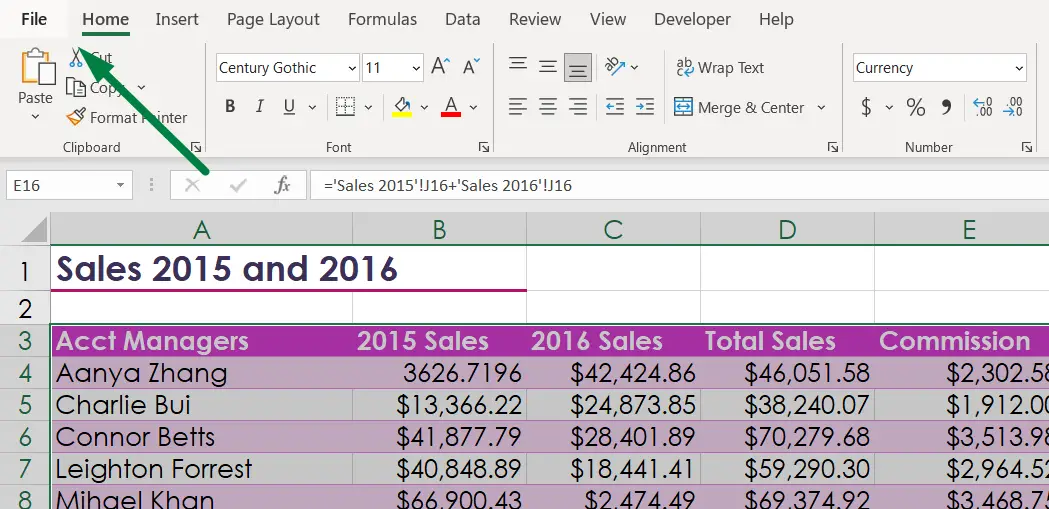
First, click on the “Home” ribbon, which you will find at the far top corner of the ribbon tabs.
A list of sections will be shown. The second step is to click on the “Options” option, which you will find at the bottom of the list sections.
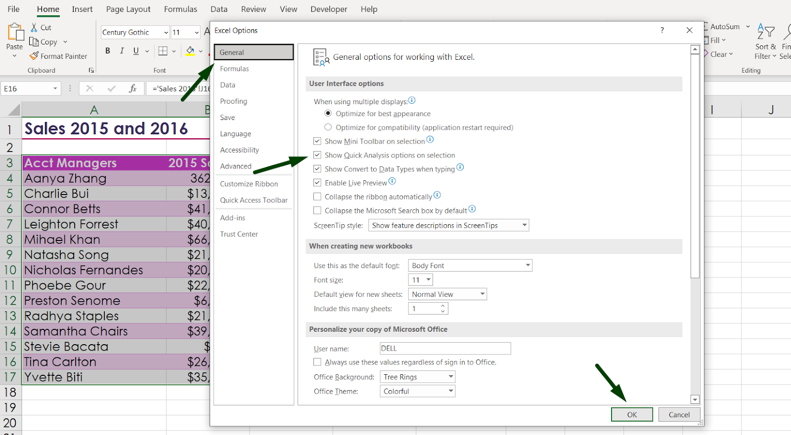
A pop-up box will open like this after selecting the “Options” button.
Click on the “General” option. You will find a “Show Quick Analysis options on selection” option under the “User Interface options.” Tick mark on that and press ok.
How to Open Quick Analysis Tool Box
Now, there are 3 ways to open the “Quick Analysis Tool,” which includes a shortcut that might be useful later. So, to use the quick analysis tool,
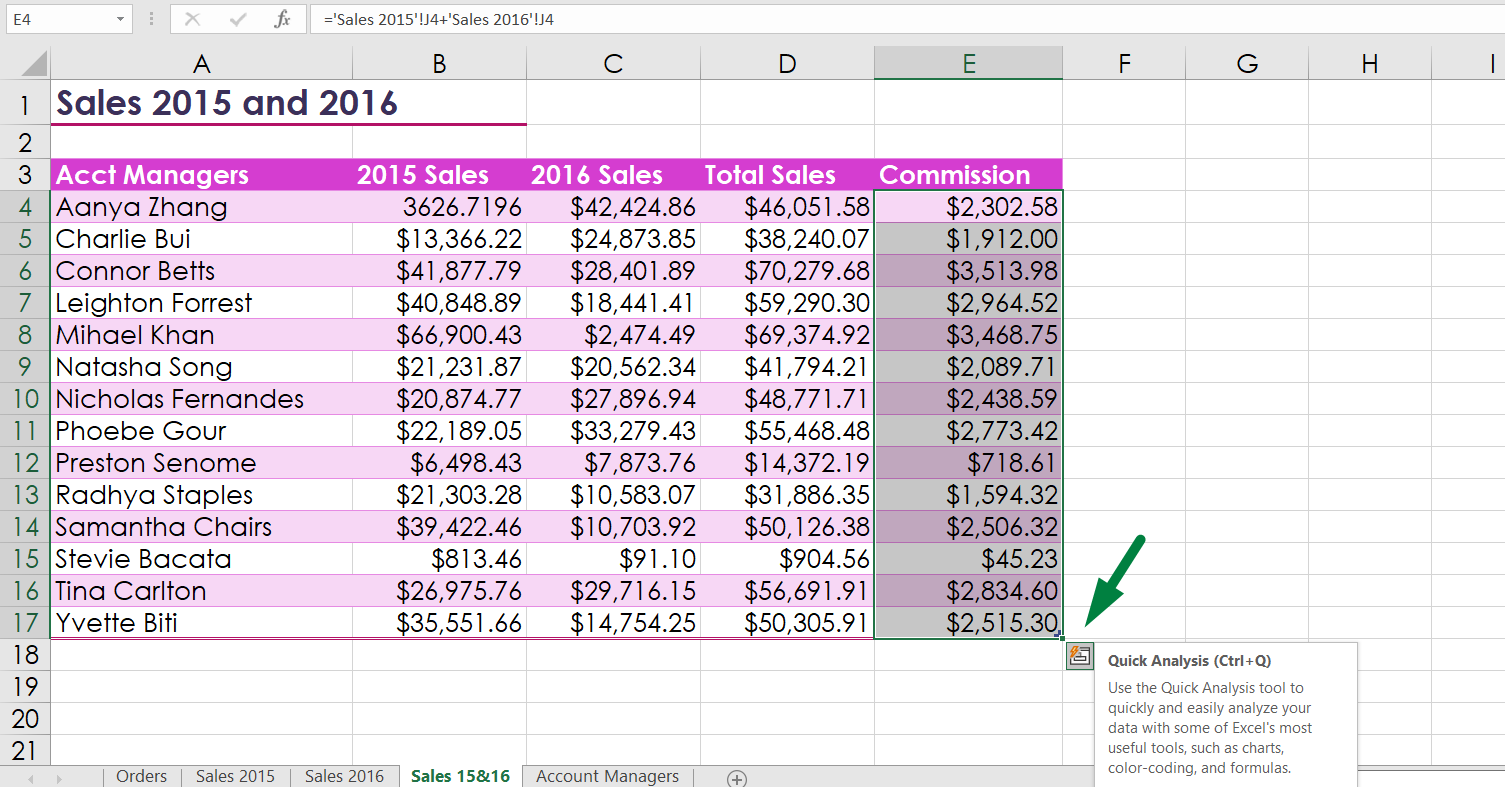
- First Way: The first step is to select the data you want to analyze. At the bottom right corner of that selection, you will see a small box that will show the “Quick Analysis” title. Click on that option, which will open the quick analysis tool.
- Second way: In this part, we will use a shortcut. As usual, select the data range you want to analyze, or If you want to analyze the whole data range of a table, just click on any cell of that data range. Press “Ctrl + Q” to open the “Quick Analysis Tool.”
So, the shortcut key for using the “Quick Analysis Tool” is “Ctrl + Q.”
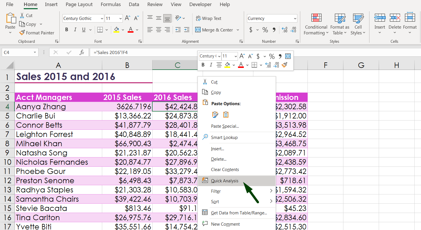
- Third Way: You can just select the data range and “right click” on the mouse, which will pop up a box like this. You will find the “Quick Analysis” tool and click on that option.
So, in these 3 ways, we can open the quick analysis toolbox. Before going into the next section, a few things to remember,
- You can not use the quick analysis tool on any blank cell in Excel.
- You can not use the quick analysis tool on entire rows or columns.
Let’s go into the next section, where we can learn how to use quick analysis tools in Excel properly.
How to Use Quick Analysis Tool in Excel to Format
One of the most handy and effective uses of a quick analysis tool is to do some basic conditional formatting.
As usual, to analyze the data, we must first select the data range.
After selecting the data range, you can open the quick analysis tool in 3 ways, as discussed in a previous section.
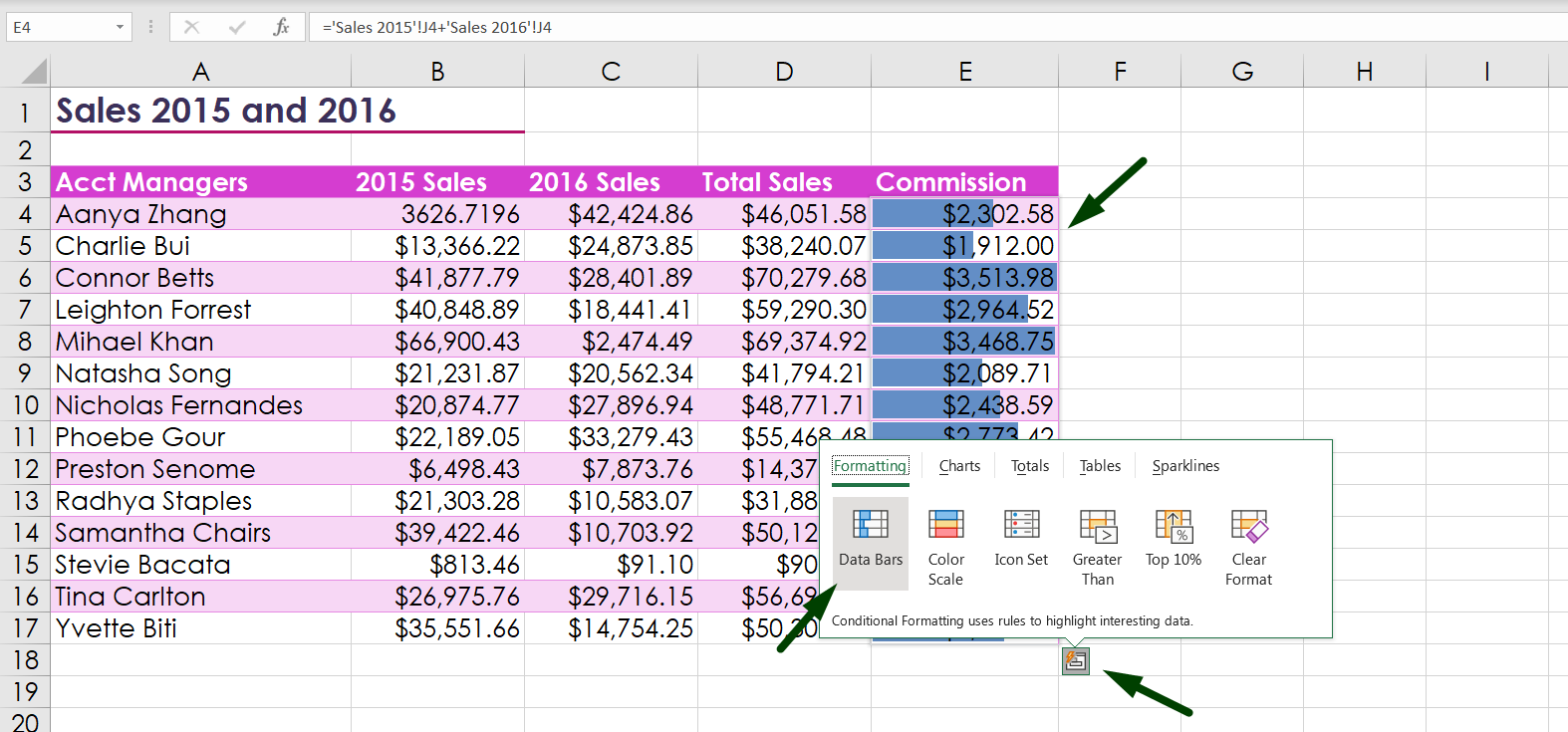
When you open the quick analysis tool, under the “Formatting” option, you will find 6 conditional formatting options in there if the data is in text or number format. You will see an additional 5 conditional formatting options if the data is in date format.
Let’s learn about the six conditional formatting options when the data is in “text or number” format.
- Data Bars: With this option, you can compare the data within the selected range. The larger the data is, the longer the bar will appear in the data cell. For example, you have 10 data where the largest number is 9, and the lowest is 3. So, the data bar for the cell that contains the number will be larger, and the cell that contains 3 will be smaller compared to other cells. And the data bar will appear larger or smaller depending on the value.
- Color Scales: This is also an option to compare between a range of selected data sets. The larger the data is, the deeper or darker the color of green that cell will be. The lowest values will be shown as a red color palette. The average numbers will show no color in those cells. For example, we have 10 values where the 3 largest numbers are 10, 9, and 8. Cells containing 10 will be shown as a deeper green color, and 9 will be less green and continue. If the average value is 5, that cell color will be shown as the default table style or plain white, and the lowest number will be shown as a red palette.
- Icon Set: With this option, the larger data or number will appear with an upper green color arrow. The average values will be shown as a golden arrow, and the lowest values will be shown with a red down arrow.
- Greater Than: For example, you want to know if your data range contains a value that is greater than a specific value and how many values you have in that data range. With this option, you can conditionally format and highlight those particular cells in a data range.
- Top 10%: You want to know which cell or cells contain the top 10% of the whole value in your selected data range. With this option, you will be able to find that particular cell.
- Clear Format: If your work is over and you want to clear out all the formats in your selected data range, you can do that with this option.
Now, Let’s learn about the 6 conditional formatting options when the data is in “date” format.
When working with cells containing dates, excel will give you these options to format your data.
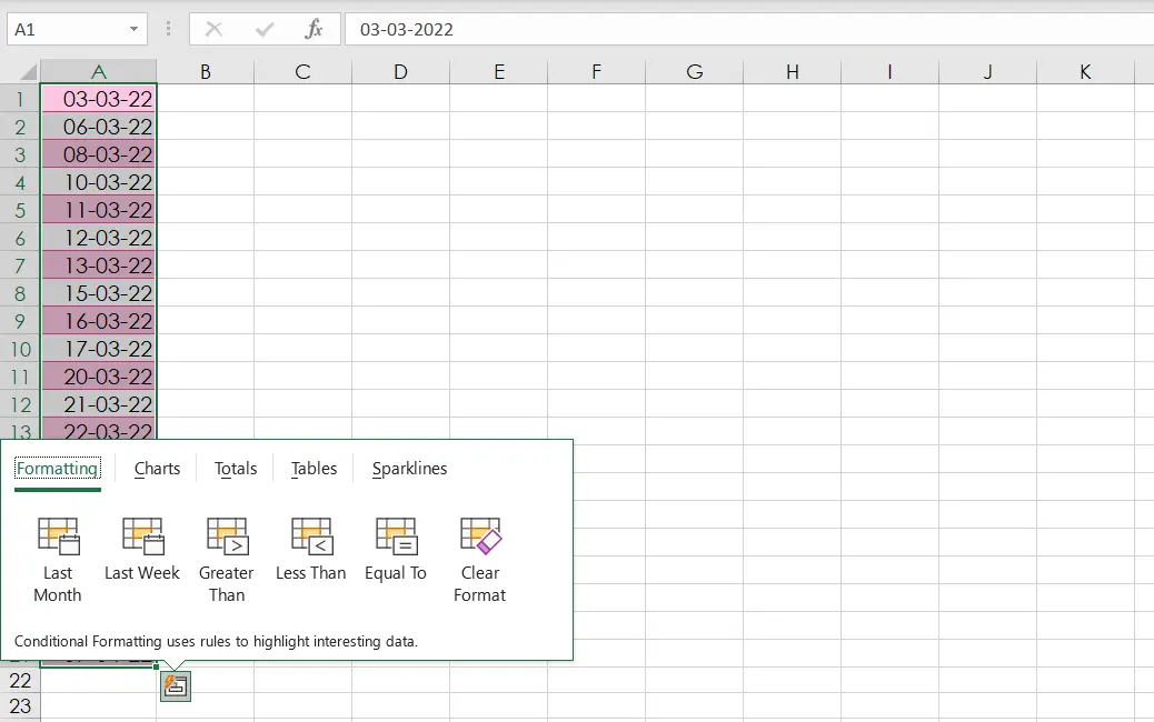
- Last Month: You have a range of data that contains dates, and you want to find out how many dates are from the last month. You will be able to do that with this option.
- Last Weak: This is the same as “Last Month,” but instead of finding dates from the last month, you can find the dates from the last week.
- Greater Than: You want to find the dates which are after a specific date. It is easier to find with this option. For example, If you want to know how many dates after a specific date of a month, you will be able to find out with this option.
- Less Than: This is the same as “Greater Than,” but you want to find the dates that are before a specific date.
- Equal To: This is easy, you want to find the cells which contain a specific date value.
So, these are all the options under the formatting section.
Note: You will find all the “Conditional Formatting” options in the “Home Ribbon” under the “Styles” Section.
How to Use Quick Analysis Tool in Excel to Create Charts
Quick analysis tool comes with another great feature: you can create charts with this option. You can insert 4 types of basic charts along with an option that will allow you to create all other chart options.
To create a chart or graph, select the data with which you want to create your chart. Or click any of that data range. After selecting the data range, open the quick analysis tool using any of the 3 options.
- After selecting the data, a small box will appear named “Quick Analysis Tool” in the bottom corner of that selected data range, click on that.
- Select the data or any cell in the data range, and press “Ctrl + Q.”
- Select the data or any cell in the data range, right-click on the mouse, and click the “Quick Analysis” option.
In the quick analysis tool option in the chart options, you will have a total of 5 options.
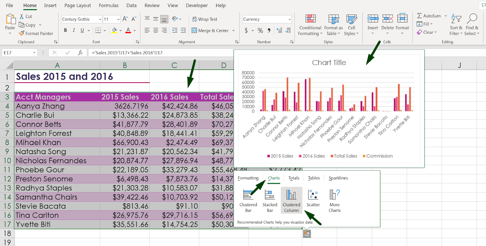
- Clustered Bar: This is one of the basic chart types we frequently use. This chart is best used for comparisons across a few categories, and the data is shown horizontally.
- Stacked Bar: This is the same as a clustered bar but shows how data changes over time.
- Clustered Column: This is the same as a clustered bar, but data is shown vertically, as shown in the picture.
- Scatter: This type of graph is usually used for comparing two or more data sets. It is also called plotting x vs y graphs. It also includes a data point by which we can pinpoint specific data in a graph.
- More Charts: With this option, you will have the option to insert a range of chart types, including Line, Area, Pie, Histogram, Sunburst, Treemap, Surface, Stock, Rudder, and many more graphs.
Note: You can usually find the option to insert a chart by going to the “Insert” ribbon and selecting any chart under the “Charts” section.
How to Use Quick Analysis Tool in Excel to Calculate Totals
This is another handy tool in the quick analysis tool. With this option, you can calculate the total of a range of data, or average, count how much data is in that column or row, calculate percentages, and even run the total. So, you will find a total of 5 options for rows and 5 options for columns to calculate various ranges of functions.
As usual, select the data where you want to perform the calculation.
Open the quick analysis toolbox.
Go to the “Totals” option. There, you will find these 5 options to perform your calculation. One important thing to remember, there are different sections for performing calculations in the row and in the columns. Options with blue color are for performing calculations in the columns and options with orange are for performing calculations in the rows.
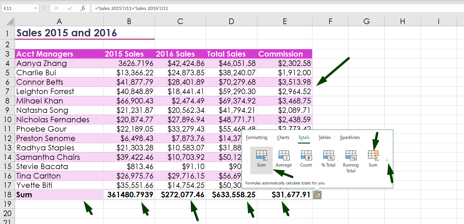
- Sum: You can calculate the total of a data set using this option.
- Average: With this option, you can perform the average of a data set.
- Count: You can count how many data is in a row and column and it will not include the blank cells.
- %Total: It will show how much each data set is in the part of a total data set when there is a range of data sets or columns or rows.
- Running Total: This option will come in handy when calculating the cumulative sum of a data set.
Note:
- You can calculate the sum of the data using these functions: SUM or use the “AUTOSUM” option in the “Home” ribbon under the “Editing” section.
- You can calculate the Average of the data using the “AVERAGE” function.
- You can count the data set using this function: COUNT. If you want to use advanced count functions, you can use these functions: COUNTIF, COUNTIFS, COUNTBLANK.
How to Use Quick Analysis Tool in Excel to Create Tables
One of the most important options in Excel is a table function. The table comes with a diversified range of benefits.
In order to create a table with your data set, select the data set. Open the quick analysis tool. Go to the “Tables” option.
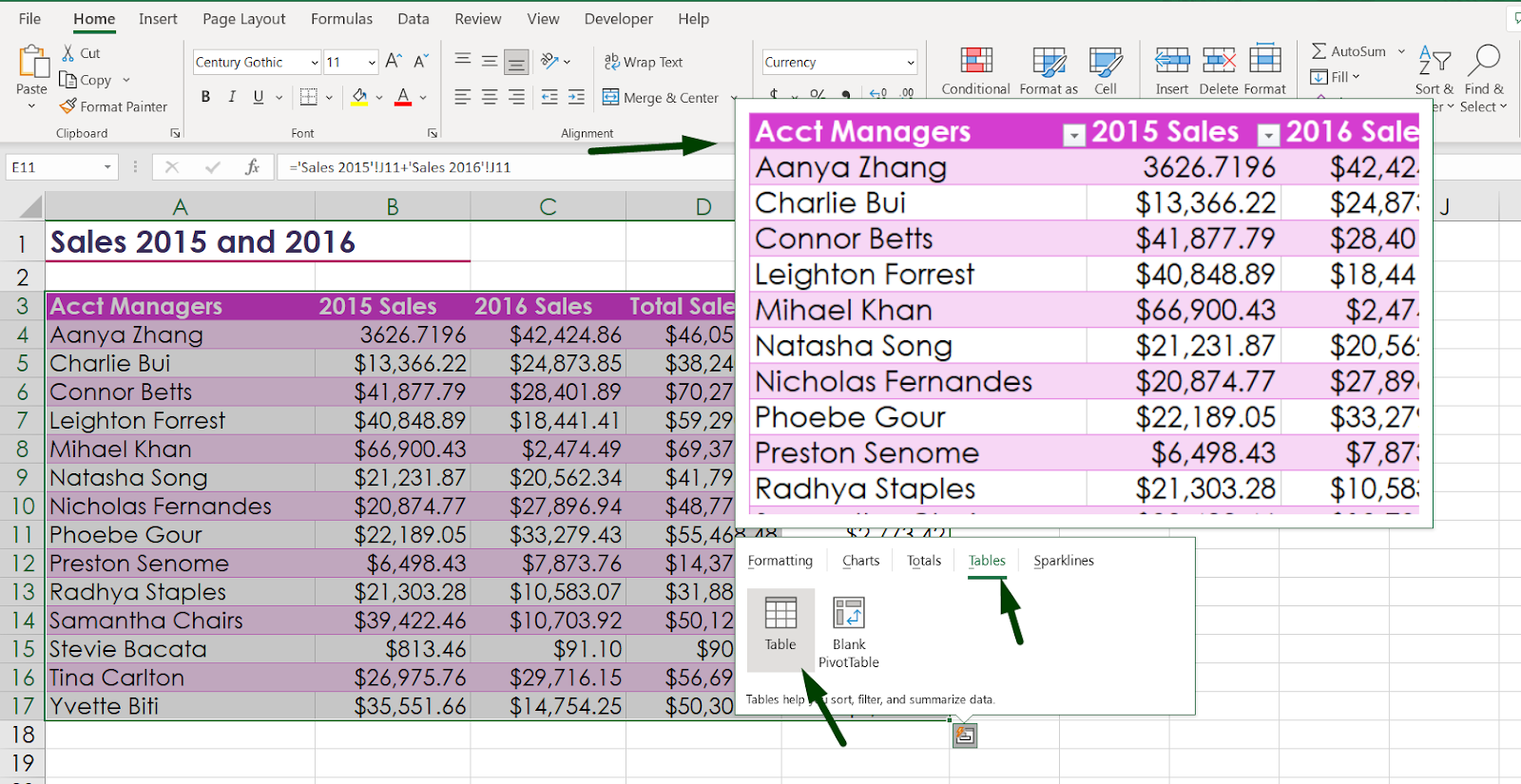
There you will find two options.
- Tables: You can create a table with this option easily. And it also shows a preview of the table like other options.
- Blank Pivot Tables: With this option, you can make a pivot table. Excel will automatically create a blank pivot table with which you can perform various functions effectively and efficiently.
Note:
- You can create a table (also a pivot table) by selecting the data and then going to the “Insert” ribbon and selecting “Tables” (Or press Ctrl + T, which is a shortcut to create a table) or pivot table options from there.
How to Use Quick Analysis Tool in Excel to Create Sparklines
Basically, sparklines are used to visualize the data by making a tiny chart in the following chart of a data set.
Select the data where you want to create sparklines and open the quick analysis tool. Go to the “Sparklines” option.
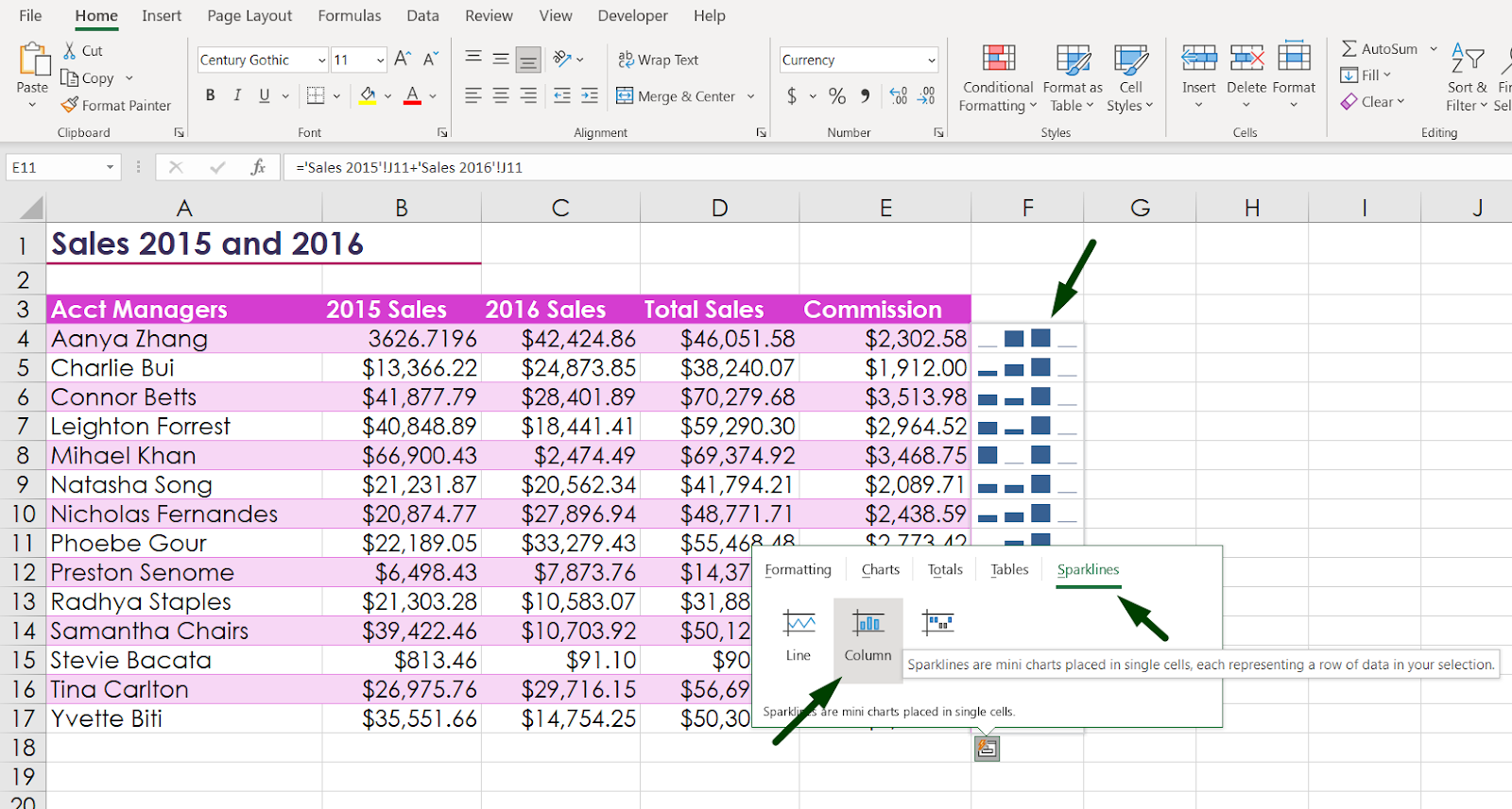
Under that option, you will find 3 options to make sparklines.
- Line: When you select this option, Excel will create a mini line chart in the following to the right side of that selected column or row.
- Column: This is the same as the line, but it creates the mini chart in column format.
- Win/Loss: This option determines the win-loss percentage of a data set.
[Note: You will find the options in the “Insert” ribbon under the “Sparklines” section.]
Summary
To summarize the whole article,
- To use a quick analysis tool, select the data set.
- Open a quick analysis tool. You can open the popup box in 3 different ways.
- Perform, create, and calculate with your preferred options.
We tried to cover most of the angles of the quick analysis tool in Excel.

Hi! I’m Ahsanul Haque, a graduate student majoring in marketing at Bangladesh University of Professionals. And I’m here to share what I learned about analytics tools and learn from you.